Browsing Tag

Ceramics

Maker Stories

Inside the Artist’s Studio with JoAnn Stratakos

July 14, 2014

Inside the Artist's Studio with JoAnn Stratakos | UncommonGoods
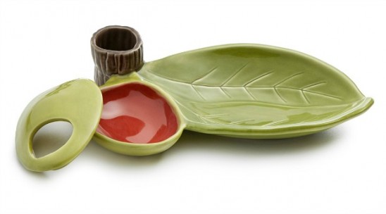
At UncommonGoods, we’re always excited when we launch a product that in time reveals itself to be a complete game-changer; an overwhelmingly popular product that sheds new light on what makes something a runaway sensation. But every once in a blue moon, we meet a new product that we know will win hearts as soon as it is placed in This Just In. Elwood the Rainbow Unicorn was the latter. From his goofy blue eyes to his chubby little feet, we were smitten and didn’t have any questions as to whether everyone else would share our love for him.

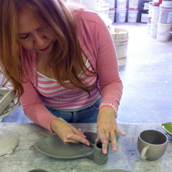
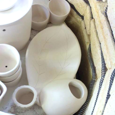
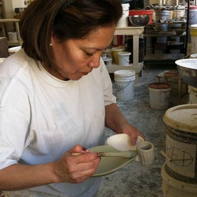
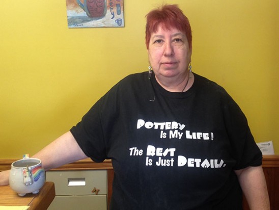
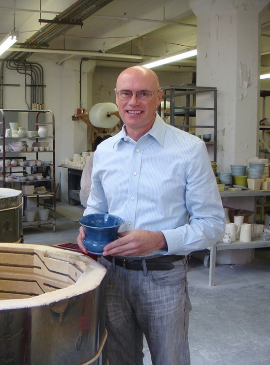
So we decided to take a trip to Pennsylvania to meet Elwood’s creator. By “we” I mean Senior Buyer Candace, Purchasing Planner Maham, and myself, and by “trip” I mean a car ride outside of cell phone service to a place where the streets had no name. Literally, we had to call when we were close so the artist could give us directions that Google couldn’t help us with. We were warmly greeted by ceramicist JoAnn and her spirited team of Mudworks helpers who were eager to show us how our most beloved new product is born. It was easy to fall in love with people as it was to fall in love with their creations so we are excited to share our visit with you.

Continue Reading…

Maker Stories

Breaking the Mold: Paul Brothe’s Ceramic Compost Container

June 13, 2014

Paul Brothe in his ceramic studio | UncommonGoodsWhen Paul Brothe decided to leave his tech executive career behind for his deep-rooted love of ceramics, he took his ability to keep things simple and applied it to his clean, classic design aesthetic. From sleek, curved candleholders to all-in-one servers, Paul’s designs blend form and function with beautiful handmade craftsmanship.

Paul’s first foray into ceramics was the crafting of a Mother’s Day present when he was six years old. “It was so exciting to me,” says Paul, “It seemed like a natural fit.” He got a job pouring molds at a ceramic factory when he was 13 and kept with it for five years, until it was time to head off into the real world and choose an occupation. Not quite keen on the idea of being a starving artist, Paul received a finance and business degree, often coming back to ceramics in his spare time. After a successful career in tech, Paul decided it was time for a leap of faith and started pursuing it full time.

For his designs, Paul simply looks to history. “We’re still making things that we made 3,000 years ago. We might decorate and market them differently, but the basic elements are the same.” Starting with a classic silhouette, Paul builds on his pieces using inspirations from museums and the world around him, careful not to compromise the original intent. “The seemingly simple are often very difficult, as there is nothing to hide behind, just a basic line, curve, or shape.” This reminder keeps him mindful with his designs, looking to iconic and organic inspiration rather than fads.

Garden Compost Container | UncommonGoodsHis sleek composter is a surprisingly chic example of this, its faux bois surface inspired by the tromp l’oeil effects used on pottery in the 19th century. The silhouette remains simple, but its adornments speak to the purpose of the piece. “I recycle everything,” says Paul, “I wanted to design something that spoke to the idea of why we compost.” A simple gardening spade handle completes the environmentally conscious display.

Energized by his new creative career, Paul continues to explore the medium with the same enthusiasm he felt when he made that first Mother’s Day gift. “Creativity is often trial and error,” says Paul, “Everything around me inspires me. When I am out on the weekend exploring my surroundings, I’ll see a building, a flower, or someone doing something that will inspire me with a new idea.”

Olive Dish | UncommonGoods

Design

Ceramics Design Challenge Winner Announced!

May 29, 2014

In the past, the judging of our design challenges have occurred behind closed doors, either discussed through a conference call or in a room with our buyers and guest judges. Last night, we decided to take quite a different spin with our judging: to make it live for the public and contestants to watch via Google Hangout! (Yes, even including the critiques!) We’re a company that values transparency and we want all of our finalists to benefit from our judging as much as possible. Sure, we can jot down a few notes, and send the comments in an email the next day — but I think we all can agree that nothing beats hearing what the judges have to say in real time.

Below is our very first Google Hangout judging session for the Ceramics Design Challenge. The judges we invited to spill their expertise onto the table about each individual piece were Joanna Hawley, a designer and the voice behind the blog Jojotastic, and our Assistant Buyer, Hannah Weber. (Gaby and I joined in on the fun by moderating the conversation and putting in our two cents when we felt it was needed.)  Be sure to watch and see who our Ceramics Design Challenge winner is!


Congrats, Ronald and Jeni! Your ceramic piece is beautiful!

Design

An Easy Answer to Olive Pit Etiquette

May 15, 2014

Enjoying olives discreetly isn’t always easy. Where do you ditch the pit? In a crumpled napkin? On the side of your hors d’oeuvre plate for everyone to see? The usual options aren’t exactly attractive. With that in mind, we created the Olive Server.

Olive Server | UncommonGoods

This innovative dish solves the pit problem, holds your picks, and displays those tangy, salty treats in style. To design the Olive Server, our Product Development Team partnered with Paul Brothe, a ceramicist who conceptualized the piece based on his love of nature-inspired ceramics, a modern, lead-free take on traditional Majolica pottery, and the goal of keeping pits unseen.

Sketches

When Brothe first presented his prototype, we loved that it was made of sturdy earthenware painted a natural green color, and provided a way to both serve olives and hide pits. From there, we made a few adjustments to make the Olive Server even more appealing to our customers who want practical serveware with a fun twist.

Original Prototype

While the original design featured a porcine, two-holed opening for depositing pits, we decided to give the pit cavern an oval shape and one larger hole. We wanted to make the piece really pop, but we didn’t want to detract from the realistic olive form, so we chose four colors to accentuate the incorporated shapes.

Process

The fruit-shaped basin is actually two parts. The bowl holds the pits, keeping them in one place for easy cleanup, while the lid keeps them under cover. We chose to line the bowl with a pimento-inspired burnt orange and give the exterior an olive green color. We also added a shade of green to the “leaf” where the olives sit and a branch-hued brown to the pick holder. Now each individually-functional element of the server is uniquely eye-catching, enhancing the look of the all-in-one display.

Olive Server | UncommonGoods

To create the finished servers, each piece is cast from a mold, inspected and trimmed, thoroughly dried, and then fired overnight at a temperature of 2000 degrees Fahrenheit.

trimming_sqfired_sq

Two techniques are used to glaze these bisque fired pieces—dipping and brushing. The glazing is done by hand using special glazes formulated in-house at Brothe’s Jersey City, NJ studio, so the colors are truly unique. The colored servers are then fired overnight one more time, allowing the glazes to fuse together and create a smooth, glassy surface.

Glazing

The result is a high-quality dish that provides an attractive way to serve olives, keeps pesky pits out of sight, and is uncommon enough to stir conversation at any cocktail or dinner party.

Buy the Olive Dish | UncommonGoods

Design

Tips for Creating a Winning Portfolio by Design Challenge Champ Tasha McKelvey

August 14, 2012

A great portfolio is a must-have in the visual world of design, but what’s the best way to build an eye-catching image collection? Ceramicist Tasha McKelvey captured our judges’ attention and won our first Ceramics Design Challenge with her uncommon piece. Here’s her advice on creating content to get the attention of art show judges, buyers like ours, and others in the art world.

Last fall I entered the UncommonGoods Ceramics Design Challenge on a whim. The holiday rush was already upon me, so I decided to take a few minutes and fill out the application right then. Otherwise, I knew I would end up forgetting and not enter at all.

Be Prepared

I already had an item to enter in mind. My Birdie Mini Dish would be a good fit for a catalog based on the size, price-point, cuteness factor, functionality and my studio’s ability to produce it both efficiently and in quantity.

Using relatively few images and words, I would need to effectively communicate all these details to the judges reviewing the applications for the Design Challenge.

With my entry decided on, I was able to pull my application together very quickly because I had already invested some time and thought into the process of portfolio presentation. The images I submitted for judging reflected the function, size and other options I offered for the mini-dish while still demonstrating the items’ consistent style.

This was the most specific mini-portfolio I have put together to date because it really only contains one piece of my work. I normally present a quite different group of images to craft show juries or gallery owners emphasizing the full scope of my work along with my particular style or voice.

Be Selective

Some time ago I created a Flickr portfolio of product images I had assembled for some indie craft show applications. I wanted to provide the show’s jury panel a link to a small selection of images I felt accurately represented my current ceramic work. Just sending a link to my website might have been overwhelming for a jury since it catalogs the entire diversity of my work. The smaller online portfolio I created on Flickr can also be a great resource to share with galleries, shop buyers, and the press.

Create a Cohesive Look

Additionally, the images are appropriate for uploading directly to an online craft show application that require image attachments for jurying. The individual images in my portfolio are actually composites; each jpeg consists of two images side by side. I combined the images using Photoshop, but there are lots of other programs available that can do the same thing. In order to better demonstrate the variety and relationships in my work, I chose to use two images in each “slide”. I put my bird bowls side by side with my ceramic bird necklaces, my ginkgo pottery with my ginkgo jewelry, my woodland gnome with my woodland mushroom mini-tray, etc.

Photos by Tasha McKelvey

Tell a Story

Take a look at the six “slides” that make up my portfolio. Notice the order I placed them in and the story such an arrangement tells. The first image is bold and eye-catching, while the last image references the subject matter as well as some of the colors in the first image (a little trick I also used with my UncommonGoods Design Challenge images too). Even though the backgrounds vary, each image shares the common themes of neutral colors and woodgrain — there is variety, but it is a consistent variety.

Know Your Audience

I use these images for indie craft shows and boutiques, but I do not always use these particular images for more traditional or upscale art and craft shows or galleries. For most non-indie shows I have a separate set of images with a gradient gray background. More traditional or high-end show juries have certain expectations for image presentation, and my casual woodgrain backgrounds might rub some of the more traditional art show jury members the wrong way. Also note that composite images are not recommended for non-indie shows in general.

Here are some examples of my images for non-indie art and craft shows.

Photos by Tasha McKelvey
The UncommonGoods buying team is always looking for great new designs. Check out our latest design challenge or show us your work through our new goods submission form.

Design

Noteworthy Design: Wedding Wishes

June 8, 2012

Picking a personal wedding gift is tricky. It has to be sentimental, but not too cheesy. Functional, but with more appeal than the stereotypical kitchen appliance. And, of course, it should be something the couple will cherish for years to come. Our community agrees, David Voorhees’ Personalized Wedding Wishes Vase has it all.

Time and skill go into creating each of these wheel-formed, hand-decorated pieces, but using the finished product is actually quite simple. Each vase comes with a wedding poem (written by Voorhees) and blank sheets for writing your own wedding wishes.

The couple can use the vase instead of a traditional guest book, or place it near the guest book table. As guests enter the reception, they are asked to write their very own special messages to the couple and drop them into the vase for the newlyweds to read on their first anniversary. Since the bottom of the vase is perforated, the artwork doesn’t have to be destroyed for the messages to be enjoyed a year later.


Our buyers loved the handmade vase the moment they laid eyes on it, but wanted a little “relationship advice” before making the commitment to carrying this uncommon good. Our voters agreed that the custom creation is certainly something special.

“This is a really great idea, beautiful and made in the USA,” Christie told us.

Renee agreed, “I think it sounds like a great idea, and gives lots of warm thoughts on the 1st anniversary…”

“I love the idea of opening this on the couple’s first anniversary! The perforated bottom is fabulous, since I would hate to wreck the vessel otherwise,” said Alli.

Now Voorhee’s design is an UncommonGood, and it’s receiving fantastic reviews from those celebrating the marriages of loved ones in their lives.

“This was the perfect answer for a wedding gift for a couple who were older, found love again, had two households to contend with and needed no more appliances or other like items,” explained Judy the aunt from Long Beach, CA. “Family and friends were able to write notes they will open in a year. What a nice way to wish a new happy couple on their way.”

Mary from Ashville, NC also shared a 5-star review: “This is my absolute favorite wedding gift to give! It is a beautifully hand thrown vase that has a personalized message on one side with a floral design hand painted on the other side. At the reception, guests are encouraged to write a personal hand written message to the couple on paper and put it into the Wedding Wish Vase. Then, a year later, on the couples first wedding anniversary, they open the vase and read all the messages the guests wrote to them on their wedding night! How awesome!! This is such a lovely, unique, personalized, meaningful wedding gift.”

We’re proud to see such wonderful feedback coming in for such a clever and beautiful handmade piece. We’re looking forward to feedback from happy couples as they open their Wedding Wishes Vases to read warm messages and words of wisdom in years to come!

The Uncommon Life

How To Repot Succulents

June 8, 2012

In the world of trends, Succulent plants seem to be taking home the crown in the fauna and flora category. And why shouldn’t they? Succulents are hardy, unique, and perfect for the dry summer heat. They don’t ask for much, but a good environment No green thumb needed — follow this quick DIY tutorial to repot your succulents and ready for your front porch or city window.

As Charlotte (you know, the one with the web) would say, Salutations! I’m Blair – the bloggin’ gal from the lifestyle and fashion blog, Wild and Precious and now that I’ve introduced myself lets chat about a way to spruce up that patio of yours!

Mix Your Potting Soil

Potting soil recipe:

  • Potting Soil
  • Coffee Grinds
  • Sand

Did you make mudpies growing up? If so, this might be your favorite part — make your own dirt mixture! When picking out potting soil just get the very most basic stuff. You don’t want anything too rich in additives — Succulents just don’t like that stuff. The goal of your dirt mixture is to get water/food/light/nutrients to and away from the roots in a time appropriate fashion. Mix coffee grinds and a little sand into your dirt before filling your pots. The sand will keep your soil from getting too over saturated with moisture (remember, these type of plants are desert dwellers – they aren’t use to a whole lot of the wet stuff) and the coffee grinds will help fertilize as well as keep away slugs and bugs that would otherwise love to nibble your Succulents down to nothingness.


Prepare Your Pot

As far as picking out pots the world is your oyster. You don’t need anything too big and can even choose to put more than one succulent together in a pot. With your pot(s) picked out fill 1/3 of each pot with sand. Do not try to cut costs (sand is cheap anyway) by bringing home sand from your beach vacation — that stuff is full of salt and your succulents will no longer be… well, succulent. Sand is important in helping move around and drain water. Once you’ve got the sand in, fill with your dirt mixture leaving a small lip of space up top.

Prepare Your Succulent

Before introducing your plants to their new home give the bottom of the existing dirts/roots a bit of a scrunch. Flare the root structure out a bit. This will help it transition better into its new/bigger/better environment. This is something good to remember when planting anything anywhere. If you don’t break up the bundle they are used to having in their temporary store shells, they might be a little too shy to branch out (pun intended) into their new world.

Pot Your Succulent

Now — where to put them? These guys are not fans of the midday sun. They prefer indirect/filtered sunlight and enjoy a nice airflow (I chose to put mine on my front porch which is roofed). As for watering — unlike planting in your garden, you do not want to water these right away after repotting. Give them some time to adjust and then give a good watering about once a week during the warmer months. Don’t ever leave standing water in your pots — it makes them angry.

Wham bam thank you ma’am we have ourselves some repotted Succulents! Call your self hip cause you’ve got the trendiest little plants on the block. Mischief managed!

Thanks for hanging out with me — pop over any time to say hi Wild & Precious. ta ta friends.

Ready to get started? Shop planters at UncommonGoods >>

The 10 Best Indoor Succulents | Indoor Plant Tips | UncommonGoods

Check out this INFOGRAPHIC to discover the perfect succulent for you. (No green thumb needed.)

Design

Designs that Shine: Uncommon Design Challenge Winners

February 20, 2012

There’s only one more week before our 2012 design challenges begin. Before we announce the next big call for entries, we’re taking a moment to share a few of the success stories from our 2011 challenges!

Although we could only award the grand prize to one winner in each challenge, many finalists also became uncommon goods. The Uncommon Jewelry Design Challenge help us discover some fantastic designers.

Wesla Bay Weller’s Cymbal of Love Pendant received more votes from our community than any other entry and was chosen by our judges to receive the grand prize. Made from recycled cymbals and guitar strings, and hung from a gold-plated bronze chain, the pendant is a great gift for music lovers and musicians.

Voters–and our judges–loved the recycled materials story, the combination of textures, and simple but meaningful design. Now available for purchase, Wesla’s piece is a hit. One reviewer told us, “I am a drummer and received this necklace as a gift. It’s very well-made with adequate length and can be worn with a variety of outfits. I get many compliments every time I wear it.”

The necklace is on it’s way to becoming a best seller. In fact, Wesla’s design has been such a hit, a whole page of our latest catalog is devoted to her story!

And the jewelry design challenge runners up that became uncommon goods? Maryann Dolzani’s Custom I Am…Pendant is inspiring women to be true to themselves (we also recently decided to feature additional charms, since customers pointed out that “I am” often more than one thing), Deb Soromenho’s Heart and Arrow Lariat makes a great gift for someone you love, Tina Tang’s Customized Name Necklace and Bracelet let you celebrate your name or a word with special meaning to you, and Irene Cheung’s Teardrop Stacking Rings are a unique take on the double-band look.

Lee from NH loves her I Am necklace so much she told us, “I absolutely love it! I haven’t taken it off since. I like the sound it makes when it jingles…Came really fast and in a little brown sack. I think it’s beautiful and very meaningful. I bought a couple extra charms to put on it.”

Our first design challenge winner from 2011 is also getting some great feedback. We teamed up with City Harvest, a non-profit organization that helps to feed New York City’s hungry and asked illustrators to help us create a new Plate with a Purpose.

Graphic designer Michael White’s winning plate design was called a “Very cool design. Great gift for charitable minded and design minded people who like to entertain,”by Dinah in Atlanta. Mo in Washington, DC said, “Great design, lovely color and it makes a great gift.”

Michael’s modern skyline design is a warm depiction of city living. His clean lines, creativity, and message won over our community and our judges. Now $5 of every City Harvest Plate with a Purpose directly benefits New York’s hungry men, women, and children and Michael’s design continues to get five star reviews.

Our Ceramics Design Challenge winner is also getting some wonderful feedback.

Tasha McKelvey’s petite stoneware Birdie Mini Dish was chosen to win for its functionality, unique design, and craftsmanship. To create the little bowls, Tasha presses the clay against a century-old barn door to give it a texture imitating the grain of aged wood.

This dish makes a great gift for many occasions. And it’s not just limited to a jewelry holder. The little tray can also be used as a spoon holder after stirring coffee or tea.

“My wife could not believe that her husband could find something so neat for her,” a customer told us. “Great find!”

We loved the Birdie Dish so much we also decided to carry Tasha’s Tiny Mushroom Ring Dish.

Tasha wasn’t the only designer to find success through the pottery challenge,either. Semi-finalist Mitzi Davis’ Bird and Cloud Dinnerware Set was chosen for the unique shape, imaginative imagery, and off-beat practicality of the bowl and plate.

Another set, Kathy Gorg’s Calla Lily Pitcher and Cups also entered our assortment. We love the symbolism of the calla lily (purity and innocence), and that the set makes a great wedding gift.

From gorgeous handmade jewelry, to fun plates for a good cause, to creative ceramics, we found some great new products through our 2011 design challenges. We’re also thrilled to welcome such talented designers into our family of artists!

Will your unique design be our next uncommon good? Stay tuned for our next call for entries!