Spring is a time when many people’s thoughts turn to spring cleaning, the traditional tidying and ritual ridding of the clutter of winter. Accordingly, this uncommon design school session considers two views on weeding out—philosophies to guide the often difficult decision of what to discard and what to keep in your home.
As Earth Day celebrates its 45th anniversary this year, it’s hard to believe that the concept of “going green” is still relatively new. While we’ve come a long way as individuals to evaluate our environmental impact, the countless designs that we interact with on a daily basis have, too.

The UncommonGoods team planting flowers for Earth Day.
In the decades prior to the establishment of Earth Day, the manufacturing industry was more interested in making green than going green: factories belched out clouds of black smoke; toxic chemicals were dumped carelessly, polluting the soil and groundwater; and bottles, cans, and paper were all destined for the landfill after just one use. At the time, most people remained blissfully unaware of the consequences of overconsumption and how negligent manufacturing practices were wreaking havoc on the planet.
After witnessing the ravages of the 1969 oil spill in Santa Barbara, California, Wisconsin senator Gaylord Nelson had the idea of bringing environmental issues to the public eye by creating an event infused with the same energy as the anti-war protests occurring at the time. On April 22nd, 1970, his simple idea for a teach-in exploded into a national event uniting 20 million people under one common goal: raise awareness about environmental impact. The little holiday that could led to the creation of the United States Environmental Protection Agency and the passage of the Clean Air, Clean Water, and Endangered Species Acts.
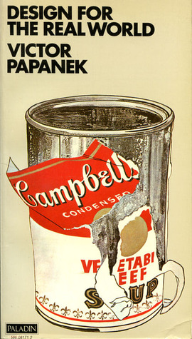
During the same era of change, Vienna-born designer Victor Papanek quietly penned his cri de coeur, Design for the Real World: Human Ecology and Social Change, an impassioned plea for reform that laid the foundation for the emerging sustainable and humanitarian design movements.
Design for the Real World: Human Ecology and Social Change, Paperback, Second Edition, Published August 30th 2005 by Chicago Review Press (first published 1972), image via Goodreads
“There are professions more harmful than industrial design, but only a few,” he writes at the start of his 1971 manifesto. In addition to pillorying his peers for producing shoddy, stylized work that wasted natural resources and aggravated the environmental crisis, he also introduced the idea of socially responsible design. Calling designers “the handmaidens of capitalism,” Papanek advocated for a triple bottom line policy, in which people, planet, and profit are interconnected and should be considered together.
UncommonGoods Founder & CEO Dave Bolotsky meeting with artisans in India.
To Papanek, ecological and social responsibility are the twin pillars of the design practice and his advice has gone on to influence a generation of designers as well as businesses like ours. As a founding B Corp, we meet rigorous standards of social and environmental performance, accountability, and transparency. We’re also proud to support designers with a similar agenda, who make it their business to come up with better design solutions for people and the planet.
Reclaimed Bike Chain designs by Graham Bergh
In 1991, after getting a flat tire while riding his bike, Graham Bergh was inspired to salvage the materials to make something new and totally unexpected. Every year, his team of bicycle craftsmen collects thousands of pounds of used parts, drawing from bike shops nationwide, and revives them into creative home accents.
Graffiti Jewelry Collection by Amy Peterson and Diana Russell
After encountering the crumbling walls of graffiti throughout Detroit, Amy Peterson and Diana Russell found the inspiration to turn these bits of urban detritus from around the Motor City into one-of-a-kind remnants of its vibrant street-art scene. Together, they work with women from local shelters to create beautiful works of art that also have a beautiful mission to improve the lives of the people in the community.
Edgar and Ollie the Puppet Pals by Jen List and Stacey Waddington
When Jen List and Stacy Waddington stumbled upon a heap of unwanted sweaters and shirts, the duo decided to transform the old fabrics into a line of snuggly and imaginative children’s toys and accessories that encourage early learning and individual expression through creative design, wonder, and storytelling.
How do you plan on celebrating Earth Day, and what “green” practices do you incorporate into your life?
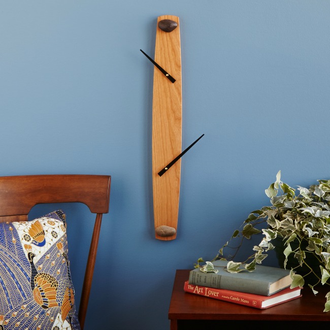
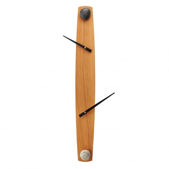
Love it or loathe it, we all know minimalism when we see it. A neutral palette comes to mind. Forms tend to be aggressively geometric. International Style buildings…Scandinavian furniture…deconstructed timepieces like our On the Other Hand Clock. Some find minimalist designs thrilling in their integrity. Others find them stark—even threatening. Whatever your reaction, one handy phrase comes to mind: less is more.
A conceptual cousin to ‘form follows function,’ this cool but cheekily contradictory aphorism is a close contender for the top modernist mantra—a quotable bit of wisdom that may still be echoing through the lecture halls of many a school of architecture and design. But, like Louis Sullivan’s alliterative catch phrase, less is more deserves an investigation of its history.
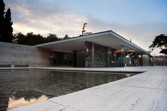
The phrase is most closely associated with the designer who embraced the association: architect Ludwig Mies van der Rohe. For Mies, it was an apt slogan for his pursuit of design purity. The intentional contradiction helps make it memorable, but essentially it means “the less complicated the design, the better.” The less of less is more is apparent in the work of Mies and other midcentury modern designers, but the more means ‘better,’ with a note of pseudo-spiritual zeal.
The Barcelona Pavilion designed by Ludwig Mies van der Rohe, Wikipedia
Much as Mies’ cigar-puffing visage comes to mind when you hear the phrase, he had to admit that he didn’t coin it. He credits his modernist mentor, Peter Behrens. The young Mies, working in Behrens’ studio, recalls that he showed his boss some design options for a factory façade, to which the elder architect replied “less is more.” This set the tone for Behrens’ elegantly minimal approach to industrial design, and Mies took up the banner for other types of buildings as well.
But wait—there’s more (or is it less?) to this story. The phrase crops up before Behrens was born, in a poetic context: Robert Browning’s poem Andrea Del Sarto (called “The Faultless Painter”) of 1855.
Yet do much less, so much less, Someone says,
 (I know his name, no matter)—so much less!
 Well, less is more, Lucrezia: I am judged.
Browning employs the phrase in an imagined diatribe by a B-list Renaissance painter who works in the shadow of the likes of “Michel Agnolo” (Michelangelo). Hardly the heroic, modern origins you might expect.
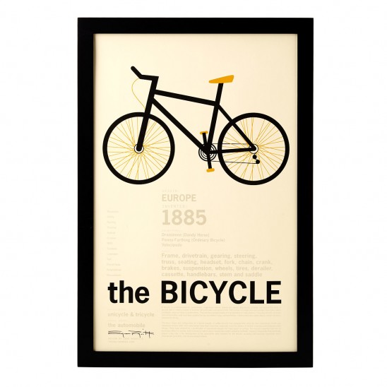 The Bicycle Encyclopedic Print
Whether or not Behrens and Mies were aware of Browning’s poem, the phrase got a modern makeover that puts a positive spin on minimalist aspirations. Not to be outdone, maverick architect Frank Lloyd Wright quipped “less is more, only when more is no good.” Apparently, Wright wanted to indicate that he was hip to mid-century trends, yet wanted to keep his options open.
From musical wine glasses to self-filtering popcorn bowls, the distinctive variety of our collection relies on interactions of form and function. Sometimes these interactions are straight out of the design handbook; sometimes, they’re more playful and ironic. Whatever the case, a familiar phrase comes to mind: form follows function. You’ve probably heard it batted around—at a cocktail party or in your undergrad art history course—but you may not know where this quotable bit of design history originates.
 The Popcorn Bowl with Kernel Sifter
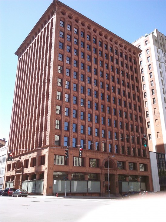
Chicago, 1896: a maverick American architect sets out to define an emerging building type that will transform American skylines from coast to coast in the next century—the tall office building, or “skyscraper.” Through a progression of projects, from the Wainwright building in St. Louis to the Guaranty building in Buffalo, Louis Sullivan showed an increasingly clear vision of how the tall office building—a form driven by commercial imperatives—could be designed to reflect its essential nature as a “tall and soaring thing.” At the same time, he put down his pencil long enough to write a sort of manifesto for his skyscraper vision: “The Tall Office Building Artistically Considered.” In this essay was an innocent turn of phrase destined for design school glory: “…form ever follows function.” Like in the old game of “telephone,” this phrase was slightly paraphrased in the retelling, becoming “form follows function,” and a design nerd’s bumper sticker was born.
Prudential (Guaranty) Building, Wikipedia
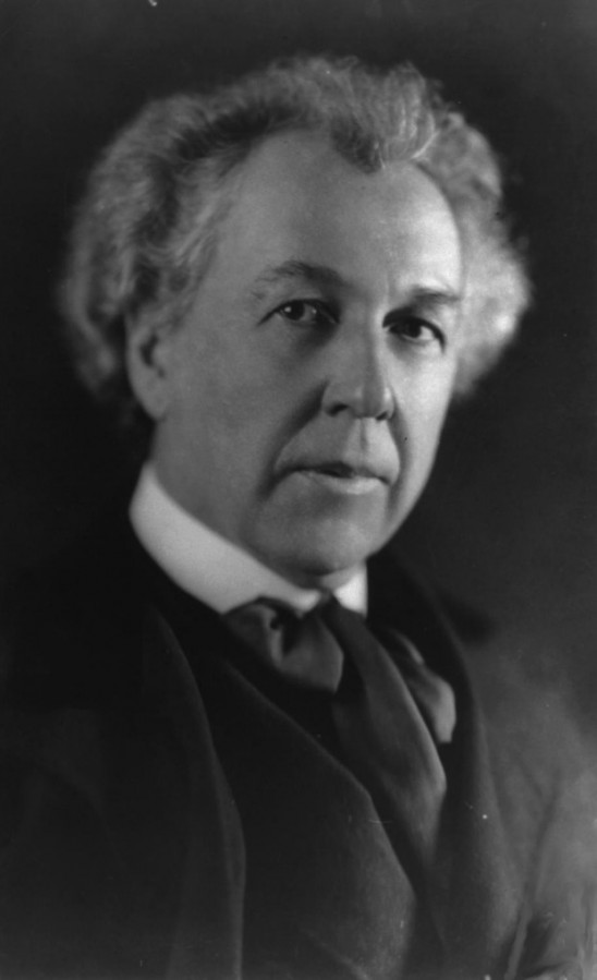
Not to be outdone, Sullivan’s famous protégé and master appropriator, Frank Lloyd Wright, adopted the aphorism but put his own transcendental spin in it, saying that “[form follows function] has been misunderstood—form and function should be one, joined in a spiritual union.” It’s a prime example of Wright extending his mentor’s principles into his own organic definition of design. But when Sullivan coined the phrase—and when Wright re-branded it—they intended it as an assertion of an aspiration, rather than the revelation of any Platonic design truth.
Frank Lloyd Wright, Wikipedia
In retrospect, Wright’s insistence that form and function are inextricable stifles his progressive potential. Postmodern design offers examples of form forcing function—one of the main critiques of branded, “starchitect” design of the last few decades. In 2009, Alice Rawsthorn declared the demise of “form follows function,” citing its fading relevance in the age of digital design.* Counter to this obituary, some recent products demonstrate an ironic inversion of the form / function relationship: Lee Goodwin’s Driftwood and Birch iPhone Docks bring unabashedly organic flair to design-for-digital applications, while Jeff Davis’ Record Amplifier draws sound from old records in an unexpected way.
So it seems that Louis Sullivan’s most quotable concept is still on designers’ pin boards today, if only as a platform for playful inversions of his intent.

