Browsing Category

Design

Design

Summer Cocktail Inspiration

June 7, 2013

After hibernating all winter I get excited for summer and opening my home to friends. I always find entertaining in warmer weather is so much easier. I can keep food simple and light. Decorating is as simple as putting out some flowers and pulling back the curtains. And I always have so much fun mixing drinks for my guests – chilling some beer and wine and setting out a festive cocktail in a vintage pitcher. This summer I plan on getting fancy with ingredients and have really been inspired by three elements – gin, flowers, and fruit. (Yes, I’ve been on Pinterest. Don’t judge.)

Gin
I’m not usually one for hard-liquor but I love ordering a gin cocktail when a glass of wine is uncool. It’s so old-fashioned and kind of classy, and there are really exciting new ways to spruce up some gin. Its juniper flavor blends well with a variety of fruits and botanicals.

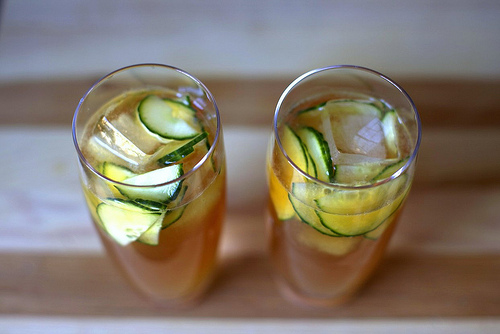
Without question, my favorite drink on a sunny summer afternoon is a Pimm’s Cup stuffed with cucumbers, oranges, and mint leaves. A classic Pimm’s Cup recipe calls for gin, and this Smitten Kitchen recipe is speaking my language.
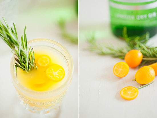
It’s easy to combine fruit and herbs in a gin cocktail. It might sounds strange, but trust me – delish! You can even get a little crazy and use kumquats like in this recipe for a Citrus Rosemary cocktail on Ruffled.
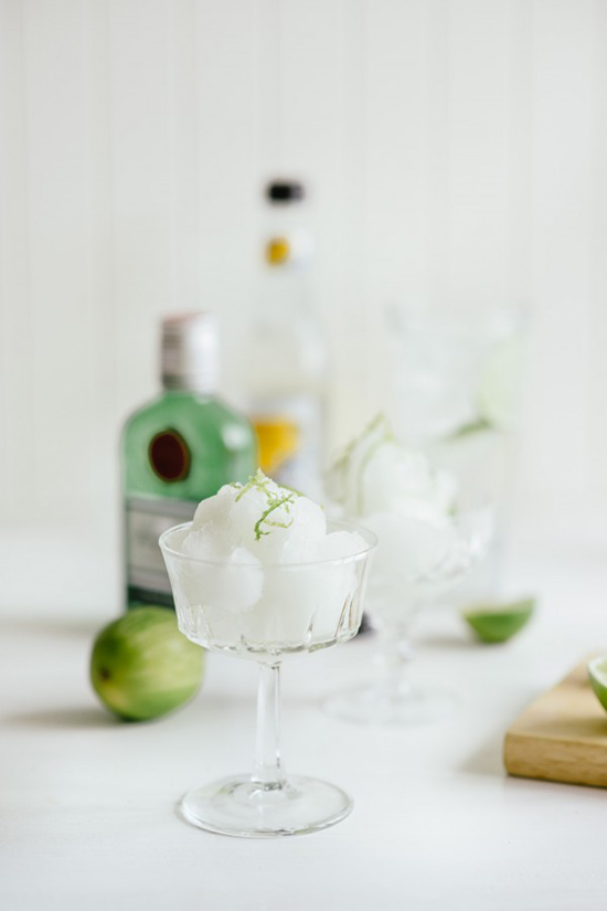
Still in the mood for a plain old gin & tonic? There’s nothing boring about this boozy sorbet recipe by Peter Georgakopoulos on The Boys Club.

Heck, the DIYer in me might even take to making my own gin this summer!

Florals
Flowers. In your drink. On your table, in your hair, and yes, in your drink. Floral flavors are becoming increasingly popular as French macarons make their rounds and it was only a matter of time until they were mulled and infused in simple syrups and mixed into our drinks.
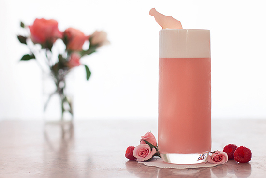
This Raspberry Rose Fizz by Joy the Baker is almost too pretty to drink. Almost.

This video of Bree from Design.Love.Fest makes me want to run out and get a bottle of crème de violette to recreate this lemon violet drink.

Fruit
This one is a no-brainer. Summer is ripe with citrus, berries, and melons and any drink would be remiss without one. But think beyond the garnish and incorporate fruit within your drinks for a refreshing treat.

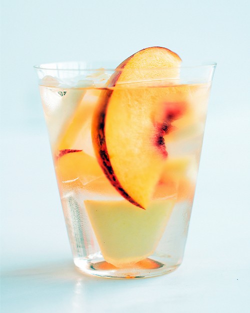
Sangria is always popular, and my personal favorite is a white blend with tart Granny Smith apple chunks and citrus. But my girl Martha (we’re old friends) makes hers with summer peaches. Perfection.

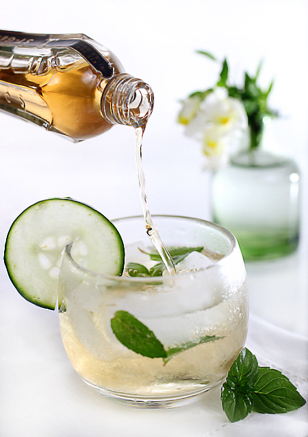
Just like Picasso went through a Blue Period, I am at the height of my St Germain’s Period. It’s great in margaritas, martinis, or simply mixed with Prosecco and cucumber in this recipe from Zested.
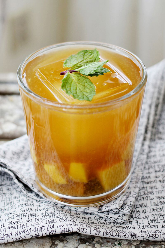
And would it be summer without some sweet tea? This Mango and Sweet Tea cocktail by Emma of A Beautiful Mess is only missing one thing – a porch swing.

Head on over to our Wine, Beer, and Spirits Pinterest board for more bartending ideas. What are some of your favorite summer cocktails?

Design

The Dos and Don’ts of Setting a Table

May 20, 2013

Growing up in a big Italian family, the dinner table was the hearth of the home. It was where everyone gathered during get-togethers or parties, whether or not there was a formal meal set down. As an adult I love having my friends and loved ones over to feed them but so far all my meals have been spread across a small apartment with plates on laps. However I spent enough time setting tables between stirring my grandmother’s gravy (tomato sauce!), reading my mother’s hip-high pile of Martha Stewart Living magazines, and the studying the copy of Emily Post that I bought at a yard sale when I was 12 to consider myself an expert in-the-making in the art of table setting.

Since I don’t have a big rustic table of my own, I have been living vicariously through my newly betrothed friends and have been dishing out dinner party advice. Here are some Do’s and Don’ts I have put together from years of research.

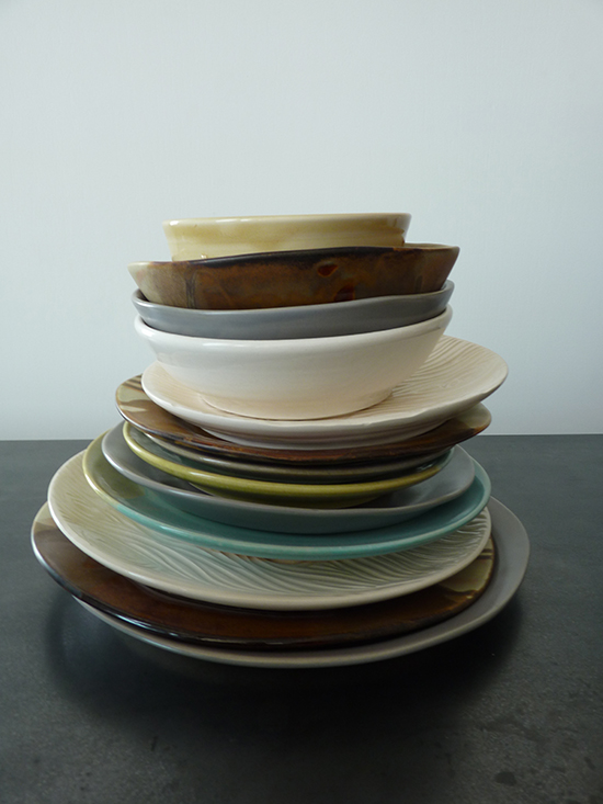
DO mix and match different styles of plates – a great way to hide the fact that you might not have enough of one style for everyone at the table!

DO give everyone at the table all the plates and utensils they will need for the entire meal… unless your butler is there to change each place-setting between courses. This means soup spoons, salad forks, any utensil they may need for dessert.

DON’T put out dessert plates until the dessert course. It’s everyone’s favorite part anyway so save all the surprises for later.

DO learn the basics of place-settings so you can bend and break the rules for your own meals and style.

Some basics: Utensils are set from in the order they will be used from the outside in. This means the fork to the far left is your salad fork; the one inside is your dinner fork. The spoon to the right of the knife is for soup, a course that comes before dinner. Forks on the left, knife on the right as it’s proper etiquette to hold food down with the fork on your left hand as cut with the knife in your right, then switch the fork when you are ready to eat.

DON’T choose a centerpiece with an overpowering aroma. Stay away from scented candles and very fragrant flowers. You don’t want the décor to upstage your amazing meal.

DO make sure that centerpieces allow guests to see across the table to keep the conversation flowing. Nothing is worse than having to talk to someone’s forehead over a ridiculously large flower arrangement.

DO get funky with your napkins. Fold them, roll them, or use a pretty ring. Napkins can really tie a whole table together.

DO provide your guests with a water glass and another for the alcohol being served with dinner. If you are offering white and red wine, choose a versatile glass.

DON’T play music that will stand out. Like your centerpieces, the music should be noticed but not enough to offend or distract. Try something without lyrics – Pandora has a lot of instrumental options that don’t sound like elevator music.

Design

What to do with all these flowers!

May 16, 2013

The trees, bushes, and bulbs are all in bloom and there are flowers everywhere! So many flowers! Kind of a great problem to have. Here are some of my favorite blog posts about how to take those blooms out of the garden and incorporate them in your home decor (and wardrobe!) in truly uncommon ways.

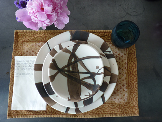
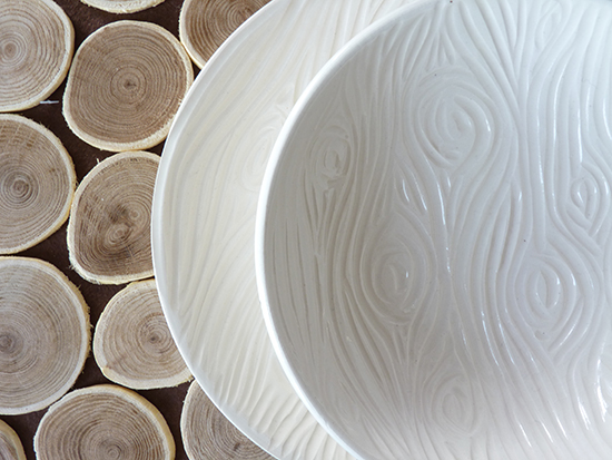
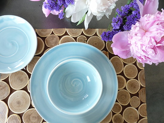
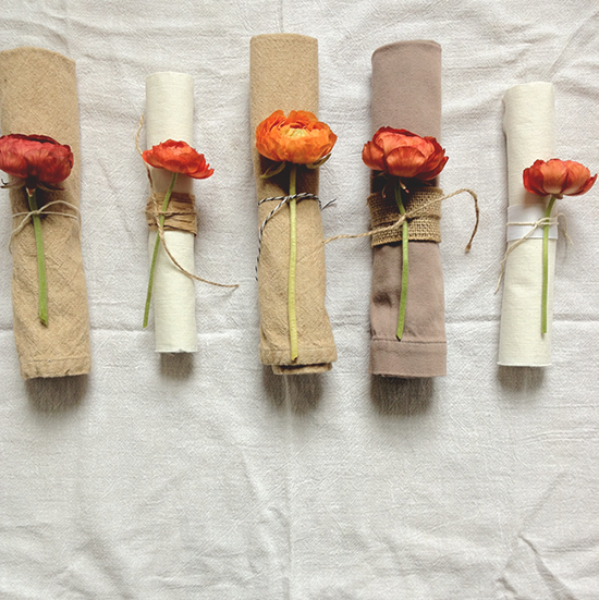
Flowers make a lovely centerpiece, but liven up each place setting with a fresh flower tied with each napkin. Use a collection of twine, jute, and other crafty scraps like Rebecca does in her tutorial on A Daily Something. It’s amazing how those peonies, pop against those neutral napkins and plates.

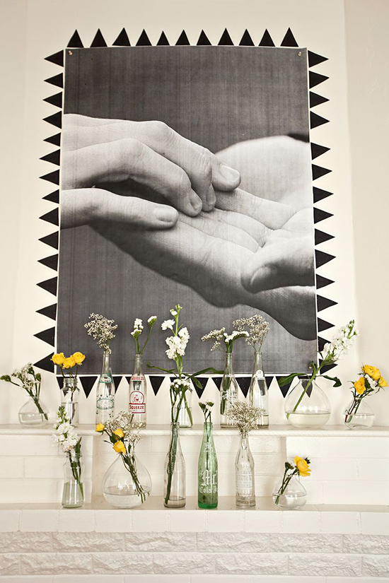
Speaking of found objects, I love the look of mismatched vintage bottles and jars as bud vases. I tend to collect a lot of old glass bottles and have never considered displaying them all together, tying the collection together with a matching bud in each bottle like Elsie has done on A Beautiful Mess.

The little girl inside of me wants to lay in a field making daisy chains all day and this DIY flower crown on Project Wedding can help me accomplish wearing flowers in a chicer way. A big flower crown is a beautiful replacement for a veil on a Bohemian bride, but I want one for Saturdays. I want to walk around my neighborhood like a chorus member in Hair and proclaim myself the flower princess.

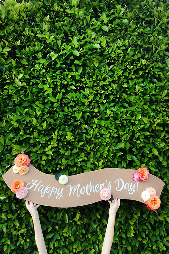
I can’t stop thinking about this handmade banner by Kelly of Studio DIY. Something about the drab cardboard background, the bright white lettering, and the pops of bright, fresh color feels so inviting (peonies!). That banner can say just about anything – Surprise!, Beinvenue, Happy Birthday. This is a craft I plan on making very soon. Seriously though, what is it about peonies that is so beautiful?!*

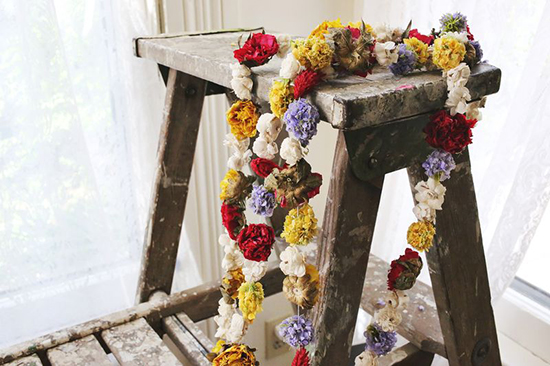
Another craft I want to do soon is Elsie’s floral garland on A Beautiful Mess. I love buntings and garlands in all forms – pom-poms, penants, tinsel – and this is one of the most beautiful ones I have seen on the Internets. It reminds me a lot of the popcorn garlands we made for the Christmas tree as a kid and sounds just as easy (however, I don’t know how my mom will feel about me traveling around her garden with a needle and thread). What’s even better about this garland is it will only get better with age – when the flowers dry and start changing color it will take one a completely new look.

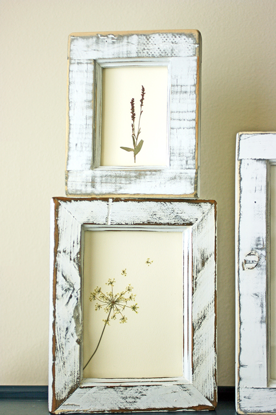
George Harrison wisely once said “All things must pass” (actually he says it a lot of times within the course of three minutes), and so too will fresh flowers so start thinking what can be done once they begin to wilt and fade. I love this pressed flower tutorial that Esther did on Pamplemousse but if you want to know everything there is to know about pressing flowers go straight to the source – Lady Martha!

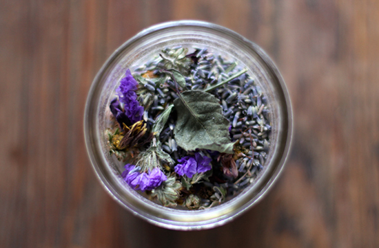
What’s a better way to preserve dead flowers than potpourri!? Store it in mason jars like in this tutorial on the Free People blog. Something about the mason jars makes it look a lot less like my grandmother’s potpourri.
Happy crafting, flower children!

Design

Square Bottle’s Refreshingly Clean Design

May 15, 2013

That stinky muck that likes to lurk in the deepest, darkest parts of your drink bottle finally met its match–but only after inspiring Clean Bottle founder Dave Mayer to invent a better bottle.

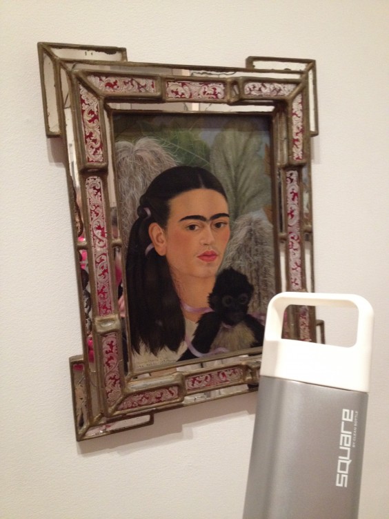
Square Water Bottle

The moldy mess lead to the creation of an innovative product–a sports bottle that opens on the top and bottom to allow for complete cleaning, but Dave, a triathlete himself, and his team of designers and engineers weren’t done there. Realizing that the design could still be improved, the team set to work to create the Square Water Bottle.

Dave running in the Ironman Triathlon

“I saw that everyone was carrying water bottles but they all had the same dull ‘fuel canister’ look and had some real design flaws,” said Dave. “We wanted to create a bottle that was as aesthetically pleasing as the clothes, handbags, shoes and phones that people also carried with them.”

The shape wasn’t hard to come up with. A square bottle makes sense, because it won’t roll away if knocked over or accidentally dropped. The challenge was making the product they envisioned a reality. It took time, but after around 40 mock ups and prototypes the Square Bottle was born. “Our final product stayed mostly true to the original design,” said Dave. “It took longer to not make compromises but it was worth it.”

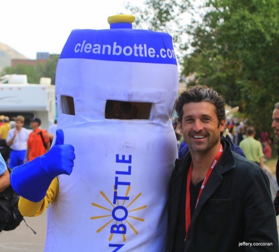
Dave as “Bottle Boy” posing with actor Patrick Dempsey and Bottle Boy running alongside cyclists at the Tour De France

The Square Bottle, like it’s predecessor, the original Clean Bottle, is easy to clean, because it screws open at both ends. It’s also durable, because the body is made of durable stainless steel, while the BPA-free plastic Vibrant Fresh Taste Lid ™ keeps your drink from taking on a metallic taste. The bottle is also slim enough to fit in a cup or bottle holder and is complete with an ergonomic handle, so it’s comfortable to take on the go.

Square Bottle on the go with Freda

Creating something that had never existed was no easy task, but time, collaboration, and hard work made it possible. “It was extremely difficult to do a Square bottle – there is a reason no one has done it, but we wanted something totally unique,” Dave,who uses the product himself every day, explained.

“People either want the cheapest or they want the best,” he said. “Aim to be one of these two and create a truly unique product and you will succeed.”

Design

El Anatsui: All That Glitters Isn’t Gold

May 14, 2013

Like most Americans, I’m pretty unaware of artists who aren’t American or European. Embarrassing but true: interpreting the art of very different cultures takes work, and I tend to approach art (as I do most things) impatiently, wanting immediate pleasure. So I’d never heard of Ghanian-born, Nigeria-based artist El Anatsui when the Brooklyn Museum opened his first solo exhibition in a New York City museum. (Which runs through Aug. 4, 2013.)

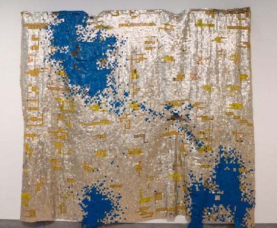
El Anatsui, Ink Splash, photo by Aaron Bunge

Ink Splash, 2010 – Photo by Aaron Bunge of Aesthetic Perspectives

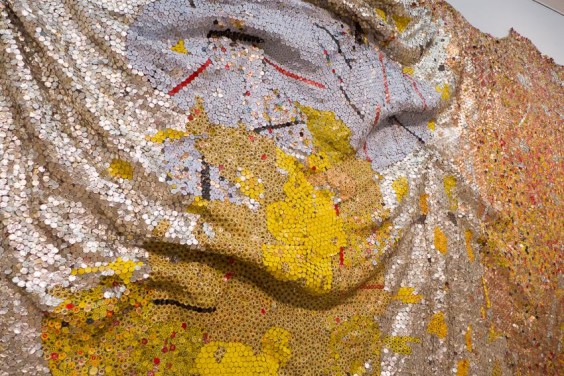
Gravity and Grace (detail), 2010, photo by Aaron Bunge

Gravity and Grace, 2010 (detail) – Photo by Aaron Bunge of Aesthetic Perspectives

Now, thanks to Kevin Dumouchelle, Associate Curator of the Arts of Africa and the Pacific Islands at the museum, who organized the show, this lazy ethnocentrista has been gifted with a reward she didn’t deserve: a broad, deep encounter with overwhelmingly spectacular art. Totally accessible on a number of levels, El Anatsui’s work drew me in, motivating me to spend much more time learning about it than I normally do at an art show. I went twice. I watched all the videos. I never do that.

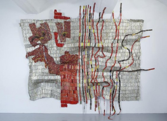
Afor, 2010

Afor, 2010 – Courtesy of the artist and Jack Shainman Gallery, New York

I thought this show would be of interest to the UncommonGoods community for two reasons: first, because it bridges the same fertile territory between “art” and “craft” that a number of pieces in our collection do, and second, because we love art made of recycled and upcycled materials. El Anatsui is perhaps the maestro of this practice.

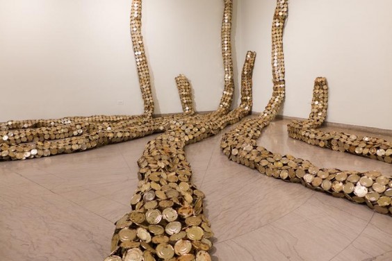
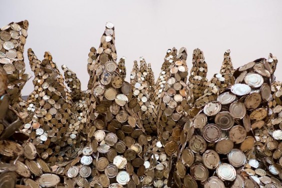
Drainpipe, 2010 and Peak Project, 1999 – Photos by Aaron Bunge of Aesthetic Perspectives

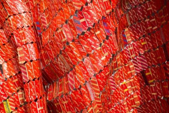
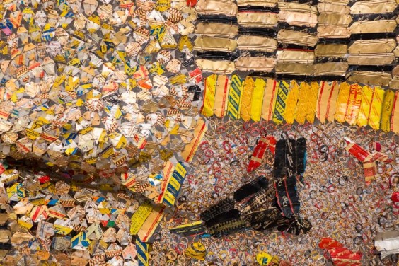
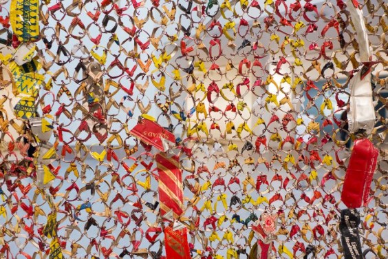
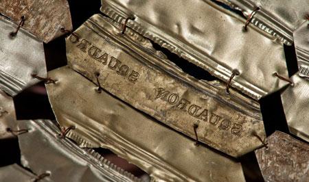
Using tools ranging from chainsaws and welding torches to improvised small crafts tools, he has marked, joined, and shaped materials ranging from yucca graters and railroad ties to driftwood, iron nails, and obituary notice printing plates. More recently, he has focused on condensed milk can tops and used aluminum liquor bottle caps, with various brand names, from a distillery in the university town and contemporary art mecca of Nsukka, Nigeria, where his studio is.

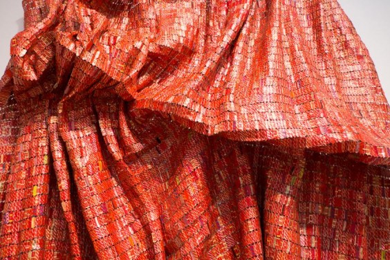
Red Block, 2010 – Photos by Aaron Bunge of Aesthetic Perspectives

Anatsui prefers not to call what he does “recycling,” and in fact, the connotations of that word are too narrow in the context of his work. The discarded materials he uses are so miraculously transformed into beautiful, shimmering, sumptuous works of art that his preferred word, “metamorphosis,” does seem more apt. At least one critic has dubbed it “alchemy,” and I can totally see why. (They’re metamorphosed into money as well; at least one piece is rumored to have sold for about a million dollars. So UG will not be offering his stuff any time soon, unfortch.)

Earth’s Skin, 2007 – Photo by Aaron Bunge of Aesthetic Perspectives

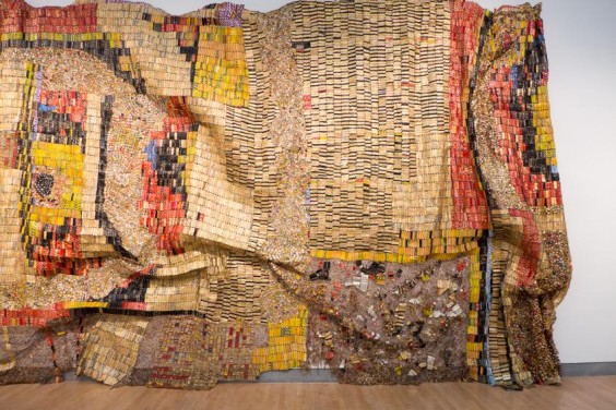
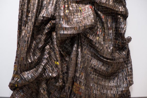
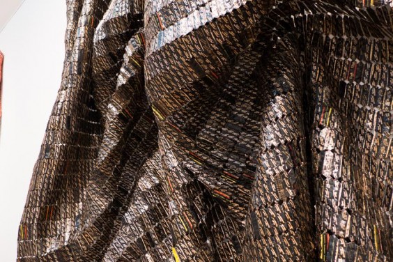
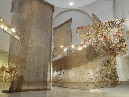
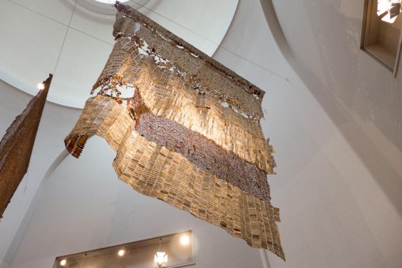
The show I saw (twice!) at the Brooklyn Museum consists of 30 works in metal and wood, the largest and most visually dominant of which are huge, mosaic-like, hanging tapestries made of the aforementioned bottle caps.

Earth’s Skin, 2007 (detail)- Photos by Aaron Bunge of Aesthetic Perspectives

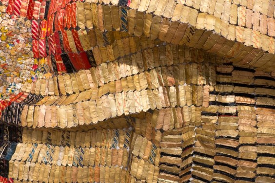
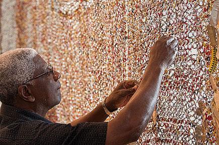
A tremendous amount of meticulous craftsmanship goes into every tapestry, as you can see in this short Art21 video. Each is composed of thousands and thousands of aluminum liquor bottle caps. Anatsui’s 40-odd assistants cut and fold the caps into a seemingly endless multitude of shapes. “For each new pattern or texture that I’m introducing,” explains the artist, “I have to show them how it’s done. Because I find that, as an artist, if you don’t maintain physical contact with handling the material… the work might end up not having a soul.”

Earth’s Skin, 2007 (detail) – Photos by Aaron Bunge of Aesthetic Perspectives

They then painstakingly “sew” them together with copper wire, patchwork-style, in a dazzling variety of color and texture groupings, Many depict traditional Ghanian symbols and patterns, while also evoking the history of the African slave trade, in which liquor was a commodity that Europeans exchanged for human beings, as well as the contemporary reality of global consumption and waste. Surprisingly, Anatsui received his early education in a Presbyterian mission with a European curriculum, and was isolated from his own culture until, in his late teens, he decided to “indigenize [his] consciousness” by immersing himself in Ghanaian culture. That probably at least partly explains someone like me found his work so easy to engage with.

El Anatsui creating his wall installation, Gli (Wall), 2010 / Commission, Rice University Art Gallery, Houston, Texas / Photo: Nash Baker © nashbaker.com

El Anatsui doesn’t like to tell curators how to hang the pieces, so they have to be strong from every angle, as there’s no way to predict what kind of stress any given area might sustain. Before uniting all the sections of a piece, his crew pulls each section this way and that, to test their strength and make sure they’ll withstand being hung and re-hung in indoor and outdoor installations around the world. Without this careful craftsmanship, Anatsui’s brilliant, painterly compositions couldn’t perform their artistic function for long.

Black Block, 2010 – Photos by Aaron Bunge of Aesthetic Perspectives

There’s no way to adequately describe in words or photographs how stunning, and varied, his work is. Some of the hangings, pieced of solid color blocks of flattened parts of caps, are monolithic and imposing, even though they’re made of what’s easily recognizable as garbage. Some, made of cap parts shaped into circles that are loosely woven together, are semi-transparent, and hang above and around you making the room you’re in look transcendentally magical, as if dust motes had turned to gold.

Gli (Wall), 2010 – Courtesy of the artist and Jack Shainman Gallery, New York. Brooklyn Museum photograph

Photo by Aaron Bunge of Aesthetic Perspectives

One of the most amazing things about his work, to me, was that usually in the art world, consumer items, brand names, and garbage are used to say something negative and depressing. We’re meant to be reminded of the way consumer culture and advertising infiltrates nearly every aspect of our lives, usually degrading the environment in the process. When I see this kind of work, I often think, “I didn’t need you, Mr./Ms. Art School Graduate, to tell me about this. We all already know it.”

Courtesy of the artist and Jack Shainman Gallery, New York

But Anatsui’s work lifts you up and inspires you in all sorts of ways: artistically, environmentally, physically, and, dare I say, metaphysically. Anatsui shows us that the possibilities of re-use to create value of all sorts are unlimited.

Design

TPC Sawgrass Golf Ball Cufflinks Tee’d Up for Tournament Time

May 9, 2013

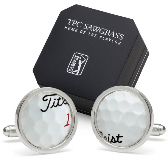
With THE PLAYERS Championship underway we’re quietly and quite politely clapping in celebration of one the newest additions to our men’s accessories assortment, PGA TOUR licensed TPC Sawgrass Golf Ball Cufflinks.

These sterling silver cufflinks feature material reclaimed from actual golf balls collected from Sawgrass’ iconic 137 yard 17th hole. While a few pro balls are sure to find their way into the water surrounding the hole during the week-long tournament, the rest of the year the course, located in Ponte Vedra, Florida, is open to the public, helping to create quite a bounty of sunken ball treasure.

As you’ll see in the video below, these balls aren’t exactly easy to recover. It takes a little hunting and some scuba gear to get them back to the green.

Milan Micich, Designer and Sales Manager at Tokens and Icons feels that sterling silver is the perfect complement to these carefully recovered golf balls. “Sterling silver, like TPC Sawgrass itself, is a rich experience,” he said. “There is only one Sawgrass, only one 17th hole island green, designed by Pete and Alice Dye, themselves icons in golf course design. It’s on every weekend golfer’s bucket list, and if a diver is going to evade alligators to scoop mishit balls off of the lake bed, the balls deserve being set in sterling silver.” (After seeing Mr. Gator show his head in that video, we definitely agree!)

“This is a gift [you] can give to a guy that connects to his emotions of having played or wanting to play this famous course and try his luck at 17,” said Milan. “Golf is a place you’ll see men laugh, shout, bicker, cry (ok, whine) and hug all in the space of an afternoon and talk about it for a lifetime…especially should a few go into the drink.”

Design

Art Crush: Denise Fiedler

May 3, 2013

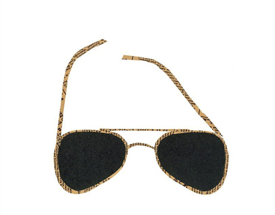
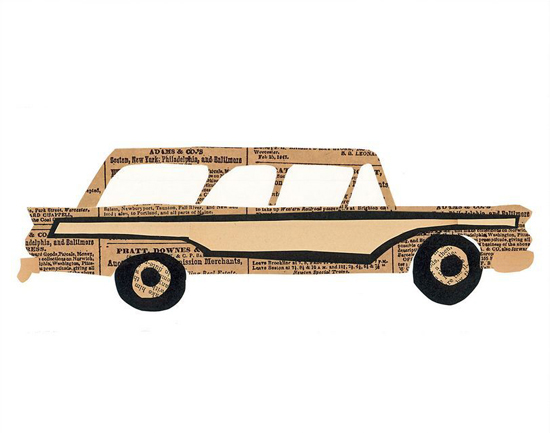
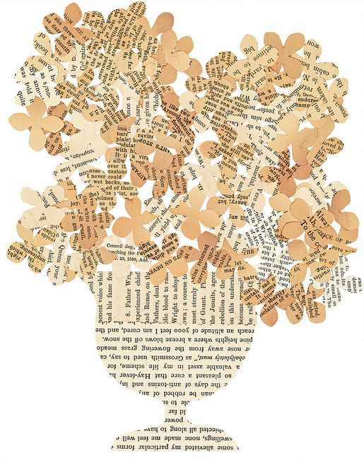
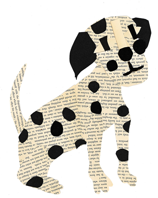
I think I have spring and summer fever. The lingering cold and snow here in Colorado has me daydreaming of warmer temperatures… and crushing on Denise Fiedler’s collages. They capture that easygoing charm of summertime so perfectly.

Denise started making collages in 2009 after one serendipitous bout of spring cleaning. While going through her attic, she stumbled upon a box of vintage books and newsprint, which she’d collected over the years from flea markets. Inspired by her forgotten treasures, she decided to transform these ephemeral materials into works of art. She calls this unique artistic endeavor paste.

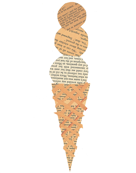
The yellowing pages and iconic subject matter give her work a wonderful sense of nostalgia. It’s like we’re looking into the past at a simpler time of bicycle rides, ice cream cones, and family road trips in the ol’ station wagon.

To construct these delicate outlines, she carefully carves silhouettes from the vintage pages and assembles the cutouts to adeptly capture the design and essence of her subjects. Denise draws inspiration from a variety of sources, including architecture, animals, food, and people who have caught her eye.

Which one is your favorite? I think I need the ice cream collage. Just imagine, it would be summer on my wall all year round… that sounds pretty great.

See more from Denise in the Uncommon Artist Gallery and read more about the works featured above: Ice Cream, Sunglasses, Woody, Hydrangeas, Dogs.

Design

How to Win a Design Challenge

May 1, 2013

After facilitating 11 design challenges over the past year, I consider myself our company expert. I sit with the buyers as they sift through the entries to decide on the semifinalist designs that will make it to our community voting app, moderate the final judging session, and communicate with the designers throughout the entire process. I am to the point now where I can anticipate what the buyers will say about each entry and finalist design so I thought it would be helpful for me to share some of my observations.

Of course the final decision always comes down to the design and how well the buyers think it will sell at UncommonGoods, but keeping this advice in mind will help you avoid some road blocks that I have seen make or break the final decision.

PRICING I thought I’d start with the technical stuff to get it out of the way and because this is a really important factor in most design challenges. UncommonGoods is a retailer so we buy artist’s goods at a wholesale price. After we buy your design from you, we still need to make a profit, so we need to have a retail price set with a fair profit margin. We measure gross margin % to gauge profitability. We calculate this with (retail price – wholesale price)/retail price x 100 = GM%.

But if you have only been selling on Etsy and at flea markets, you might not have a wholesale price figured out yet. Many independent sellers are currently selling their items retail at a wholesale price! Stores like UncommonGoods will need to charge almost two times that amount to make a profit, and we won’t want to sell your design at a much higher price than a customer can get it on your site. This might mean going back to the drawing board but a strong pricing structure could really benefit you in the future.

Senior Buyer Erin Fergusson advises, “Research what is out there in the market place and understand the range of retail prices for similar products. Be sure to note the materials and how something is produced (handmade vs. manufactured) in order to understand where the cost is coming from.”

To understand pricing a little more, check out this really informative forum discussion between Etsy sellers.

Tell your product story well and completely! Some artists do a great job telling the story of their design in the Product Description field on our online submission form. Some artists don’t and it can really hurt them. This is the space to let us know all about your inspiration, your artistic process and how the design makes you feel. This is the space to tell our buyers everything you want them to know about you and your art.

If your design is chosen to be a semi-finalist, this is the copy we will edit for grammar and punctuation to use in the community voting stage-so this story won’t just attract our buyers, but also the thousands of voters who will be viewing your design. Good product copy can make or break your chances with the voting community, the buyers, and the rest of the judging panel.

Our buyers love collections. When I sit with a buyer and go through design challenge submission, more often than not we are also visiting an artist’s website to see what else they have. Not because we’re nosy, and not because we don’t like what we see. Our buyers want a sense of an artist’s future as a vendor at UncommonGoods. They’re looking for an artist that will be able to create a collection of similar products. Check out Valerie Galloway and Etta Kostick – former design challenge participants with robust collections.

Be prepared for our inventory demands. Our inventory requests for each design are always different depending on price and category, and our buyers work to create a plan with each designer that is beneficial to both parties. One common question you should be able to answer is “how many of these can you make in a week’s time?” Don’t know the answer to that question because you’ve only ever made one? That’s ok too, but have a plan in place for scaling up. (Get some advice from our current vendors here!)

Send a product sample, NOT a prototype. Most challenges require the semifinalists to send in their design for the buyers to review. Even if a design doesn’t make it into the top five designs that are judged, the buyers will review all the samples that come in. So many other artists are eager to get their designs into our buyers’ hands-but so many times I see samples with unfinished edges and chipping paint. Who knows when you will get another chance.

Send them something that shows the true extent of your talent. Before you send out your sample think, is this something I would send to a paying customer? Remember, when our buyers have your design in their hands they are thinking the exact same thing.

Stay tuned to our Twitter to learn about new design challenges and enter our Art Contest all year round!